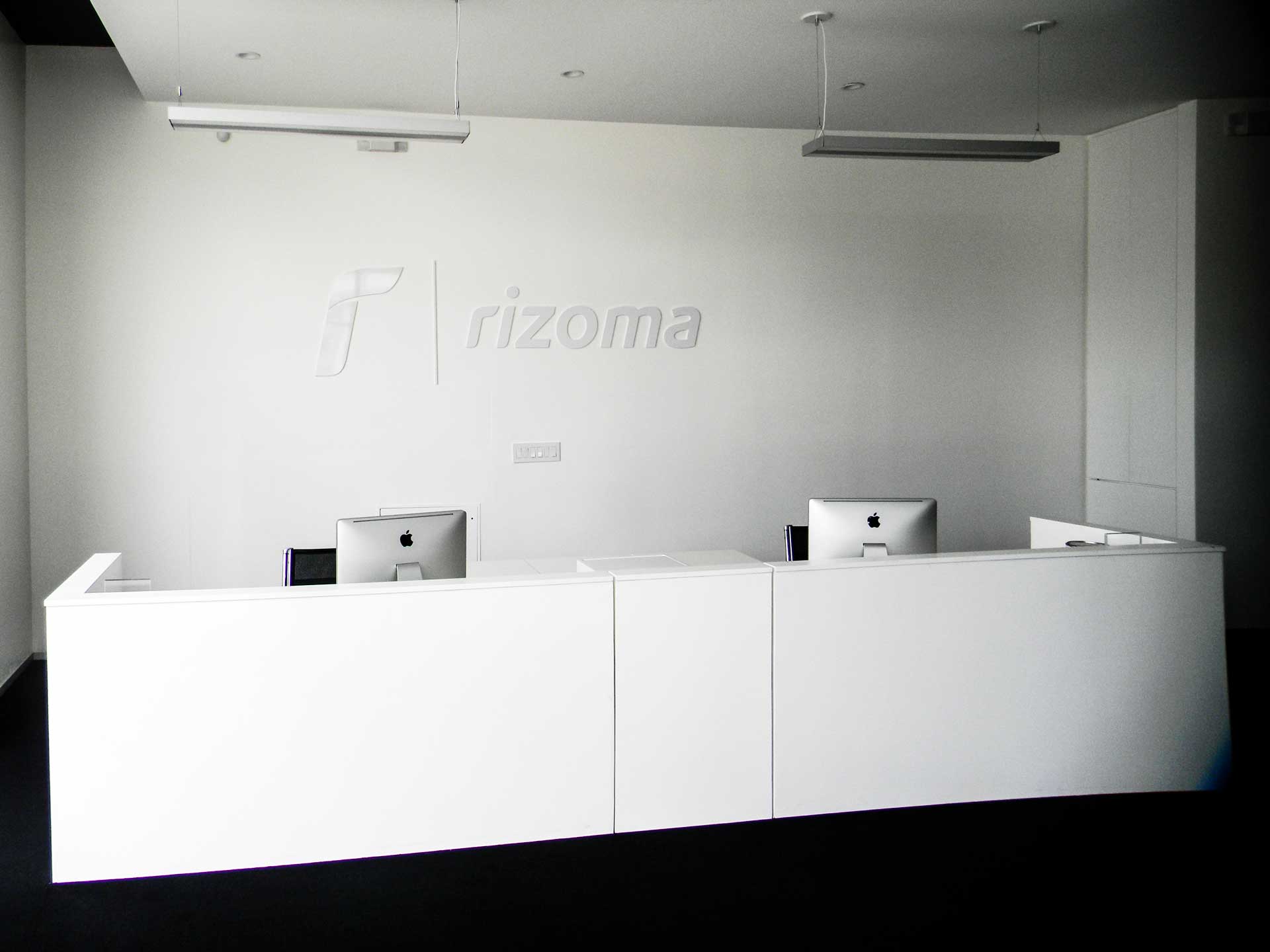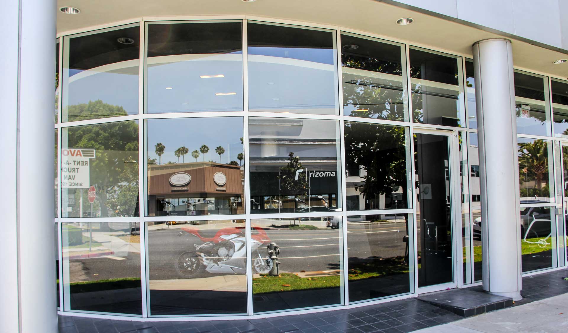

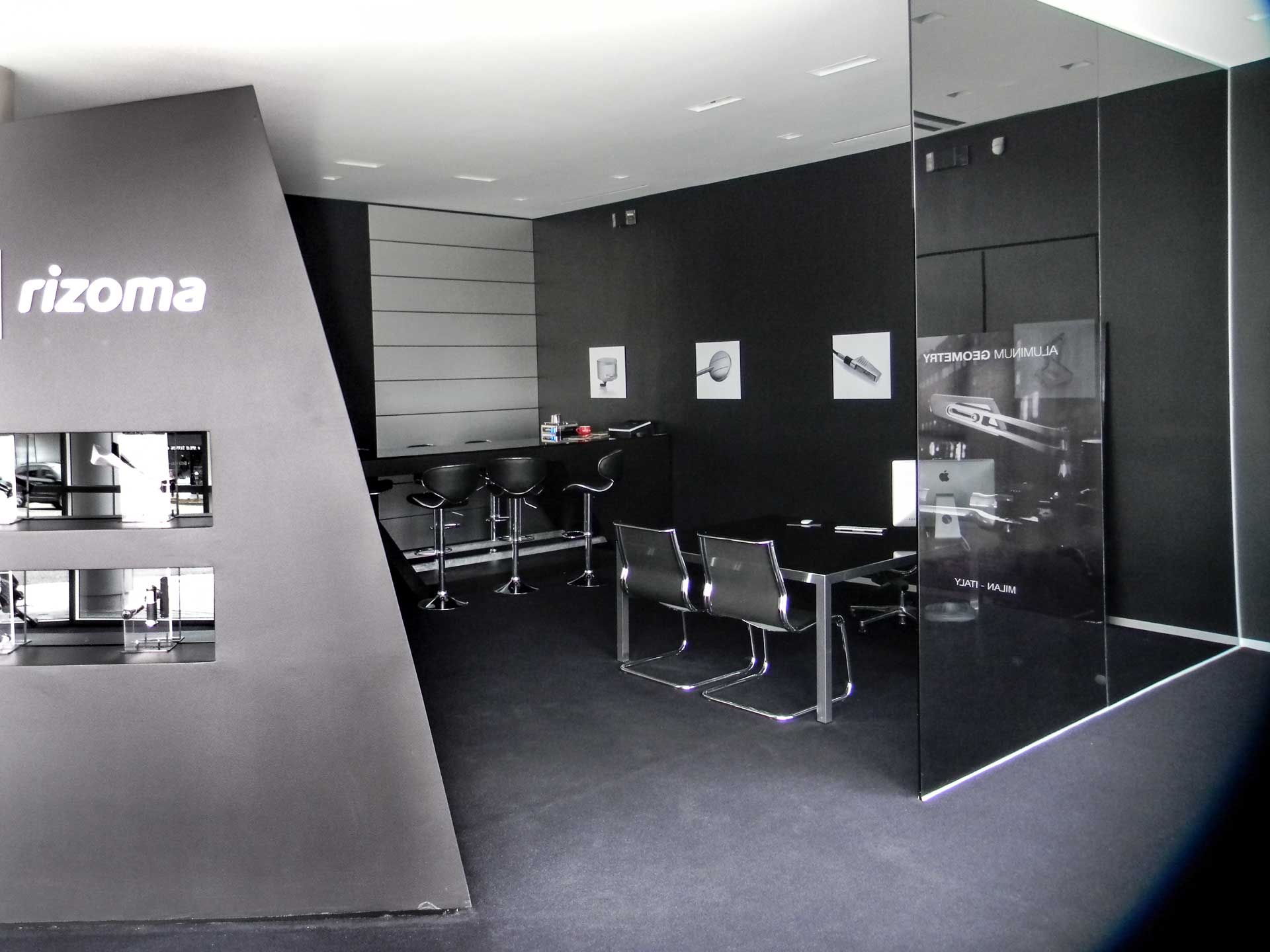
This accessories showroom for Italian motorcycle manufacturer Rizoma began as the ultimate blank slate — a bare, single-room commercial space fronting a main thoroughfare. The design and construction team behind 24 gladly accepted the challenge, creating a combination retail/administrative office that reflects the sleek, high-end design aesthetic of the Italian brand. The all-important first step was designing a floor plan that broke the cavernous room into different spaces — both functionally and visually — and creating a color palette that would support the client’s machine-driven brand.
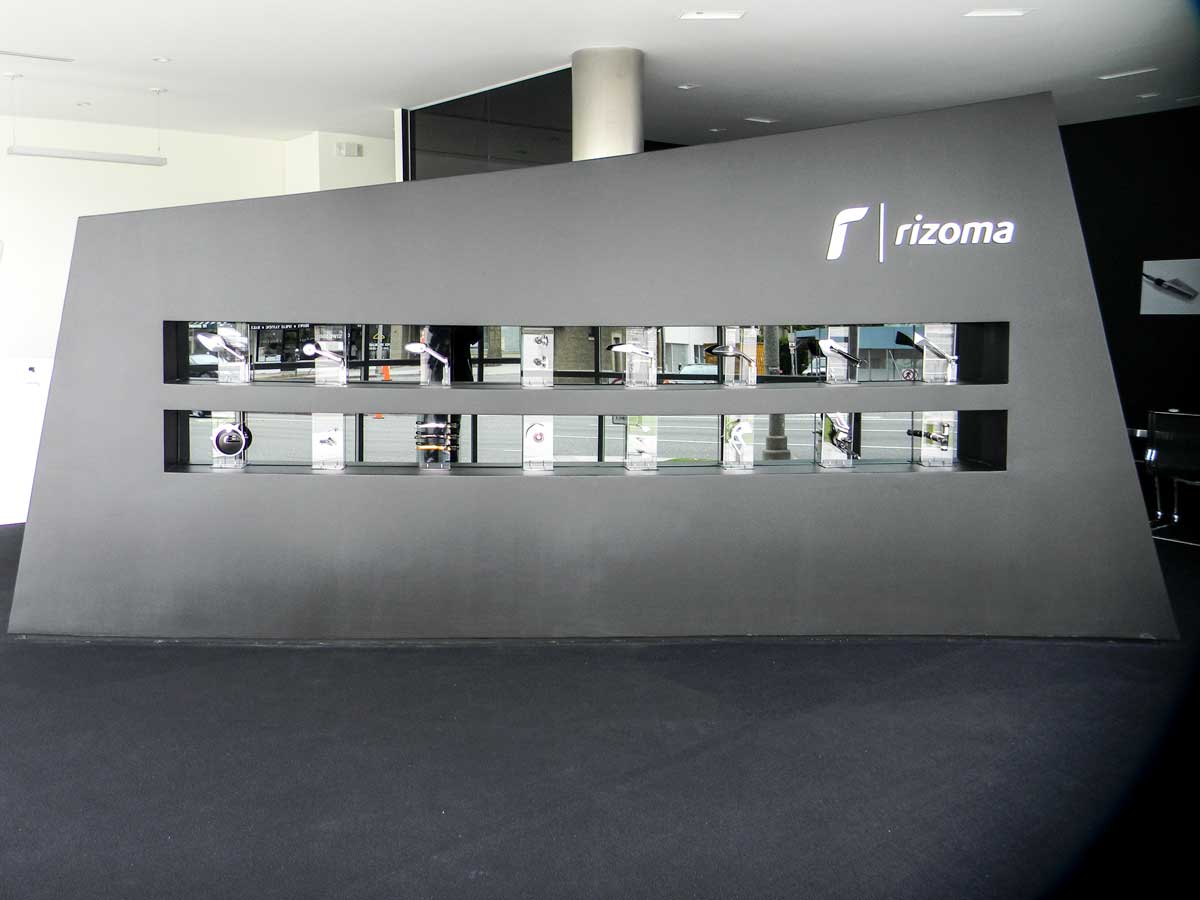

An open-sided consultation/lounge area was created using grey smoked glass partitions, brushed metal pillars, and a custom-built bar counter with an angled support leg reminiscent of a jagged racing stripe. In stark contrast, the reception desk area is white on white, with industrial steel fixtures. The focal point of the showroom, though, is an enormous custom-made, irregular –shaped display case parked diagonally across the showroom floor like an intriguing black iceberg.
An open-sided consultation/lounge area was created using grey smoked glass partitions, brushed metal pillars, and a custom-built bar counter with an angled support leg reminiscent of a jagged racing stripe. In stark contrast, the reception desk area is white on white, with industrial steel fixtures. The focal point of the showroom, though, is an enormous custom-made, irregular –shaped display case parked diagonally across the showroom floor like an intriguing black iceberg.
